Bangalore-based design studio TSK Design rebranded an Indian textile major, Himatsingka Seide Ltd. Himatsingka is an integrated global textile major that designs, develops, manufactures, distributes and retails a suite of textile products. The company manufactures fabrics for bedding and bath, ultra fine count cotton yarn, and drapery and upholstery fabrics.
At the time when major textile companies in India were folding up, Himatsingka built itself into a powerful company. The company operates across North America, Europe and Asia. And the new identity by TSK Design is reflective of the growth and resilience of the company.
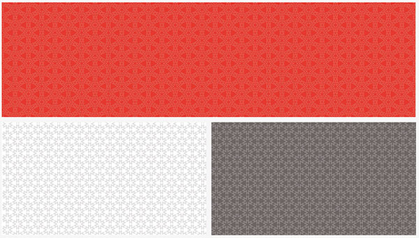
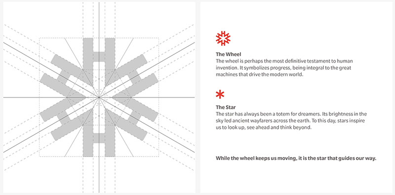
Tsk Design employed the alphabet H as a motif to create ‘Himatsingka Wheel’ that has six Hs arranged in way that an asterisk symbol is formed at the centre. The project started in May 2019, and the new brand mark was revealed soon, in July 2019. The geometrical form of the new brand mark makes for a versatile identity that can be applied across company’s assets. The symmetrical nature of the logo also allows endless possibilities in creating patterns and registering subtle presence in communication or other assets of the company.


The new brand colours are bright orange and sombre grey. The vibrant orange stands out, and is a major change from the company’s earlier palette. In all, TSK Design has created a sharp and dynamic identity for Himatsingka group.
While most of the branding roll out was completed by March this year, the covid-19 pandemic has delayed certain implementations and the launch of the website.


**
Images courtesy TSK Design.


