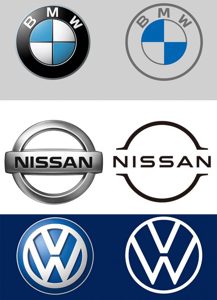
In the first decade of the 21st century, most international car companies added tonnage and 3D effects to their brand logos—shadows were dropped, metallic look was added, beveled edges were created. The car logos with chrome effect emulated the metallic badges on the vehicles. “Automobile industry world-wide uses logos for badging of vehicles, that’s how the trend of 3D came—first for badging, then some companies started using badge as their main identity,” says Sudhir Sharma, head of design and marketing at ValueLabs, an IT company based in Hyderabad. Sudhir has designed the iconic Bajaj logo and was long associated with the automobile sector, specifically Bajaj Auto.
Decade later, the 3D and chrome effects are being removed and automobile companies are returning to flatter, minimal logos.

The most common reason for this shift cited by the car companies is to enhance compatibility with digital technology. It is assumed that in future people will interact with their vehicles through phones and smartwatches, and flattening the logo will help in flexibility and reproducibility, making it better for digital applications.
In fact, the trend of flattening logos was started from iPhones, precisely when apple upgraded to iOS7, with which all glossy, textured logos turned into their flat, non-shiny versions. (Well, windows 8 had flattened icons, but did the world go flat after that. Answer: No, it was the iOS.)

This was in 2013, and since, international automobile companies have been adopting flatter logos. Among other major car companies, BMW and Nissan have undergone the rebranding exercise this year and one could wonder about this tearing hurry to go flat, because there hasn’t been a path-breaking development on the digital front that is transforming the auto industry.
“Changes [in India] are personality driven, usually by a new head of marketing who needs to claim ‘a change’ in the portfolio… Very rarely changes are driven by need or requirement.” — Sudhir Sharma, head of design and marketing at ValueLabs, and designer of the iconic Bajaj logo.
Sudhir says that the logo change is not necessarily a reflection of the change in the digital landscape. “Companies are going back to that style for many reasons. First, more and more auto companies think of themselves as tech companies (Tesla effect) and want to appear as one. Also, the best engineering talent is going to tech companies now. And second, to stand out and become more relevant,” he says.
The shift to electric cars is also cited as one of the reasons for this shift. ID.3, the first fully electric vehicles by Volkswagen, will be the first to have the company’s rebranded logo. In fact, some publications reported that the company rebranded with flat logo to mark the beginning of the electric era.
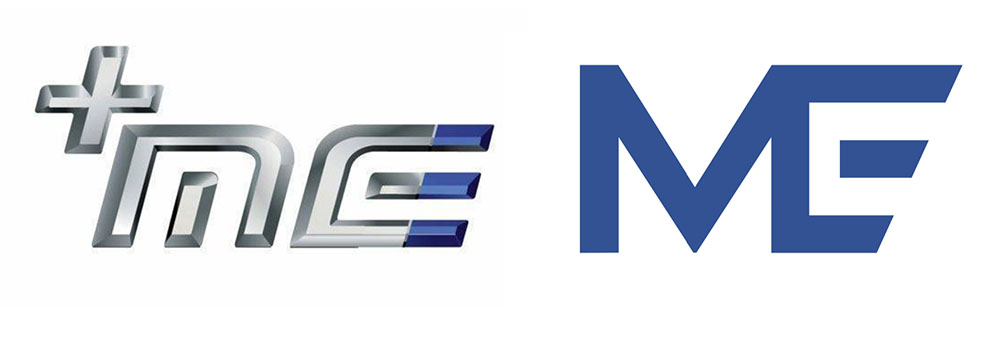
Early this year Mahindra Electric Mobility Limited, that has been working on electric cars in India, unveiled their new corporate brand identity. Keeping with the global trend, the ME logo lost its 3D effect and metallic look, and was flattened into a more angular, blue brand mark. “The new identity also enhances the brand’s digital presence by ensuring the logo works seamlessly on digital assets, on electric vehicle components, and on electric vehicles,” drivesspark.com, a digital magazine reported.

Unlike international car companies which exhibit a clear timeline of changes in brand’s identities, developments in brand identities of auto companies in India is confusing. Consider the Mahindra Electric logo above. The company released the identity with a new tagline, change in font, and logos for Mahindra Electrical and their software for electric cars NEMO, all of which were reported by the media. But one cannot find above logo even under ‘New Identity’ section on the website. (Finally found it tucked at the right bottom corner under ‘Products’.)

Or Maruti Suzuki for instance. The confusion regarding the brand name, logo (or logos) has initiated a dozen queries on Quora where strangers try to help each other make sense of what is happening with Maruti and Suzuki and why. “Changes [in India] are personality driven, usually by a new head of marketing who needs to claim ‘a change’ in the portfolio… Very rarely changes are driven by need or requirement,” says Sudhir.

Indian automobile companies have also used logos with chrome and 3D effect in the previous decade, but these had been short term—for an event or a project or just briefly, to keep up with the trend; not as a part of a definite, coherent shift in the brand image. Sudhir feels that the articulation of logo and brand change in India is usually not honest. “Perhaps because this industry is driven by benchmarks; original thoughts and work needs self-confidence,” he says.
**

