
Calligraphy is an enigma. Its enduring, popular appeal may let us take it for granted, obscuring the question of why, in the age of mechanical text, we revel so conspicuously in it.
The first, easy answers heard most often—antiquity and beauty—are, by themselves, inadequate. Little of the antique survives in our consciousness. And simply quoting beauty is circular (leading to the inanity that we like it because it’s beautiful and beautiful because we like it), unless qualified—so read on.
Up to and during medieval times, when reading and writing were not widely distributed skills, calligraphy was a utilitarian tool for official work, and for the production of books for the very rich.
The Deep Design of our abiding love for calligraphy is that it is born in manufacture, and is thus as recent. Up to and during medieval times, when reading and writing were not widely distributed skills, calligraphy was a utilitarian tool for official work, and for the production of books for the very rich. It was beautiful in the way that craft is, but beauty per se was not the point. The word itself, in English, dates to 1604, well after the birth of print, the technology that pushed books from the realm of craft to objects of manufacture.
Though many medieval crafts and arts have died, calligraphy thrives. The base reasons is cultural: manual writing still survives the keyboard.
It’s intuitive that the value we place on calligraphy should rise in proportion to its replacement by printing, and that in a paradoxical way, the art of calligraphy is a consequence of printing. This is explanation no.3: we value calligraphy as we do a craft. For craft objects remind us that with manufacture, we traded individuality and beauty for economy, abundance and choice. (It took modern design to make manufactured objects desirable.)
Though many medieval crafts and arts have died, calligraphy thrives. The base reasons is cultural: manual writing still survives the keyboard. With the standard of everyday handwriting in free-fall, we admire good writing. As an extension of functional writing, it is a picture of us at our best.
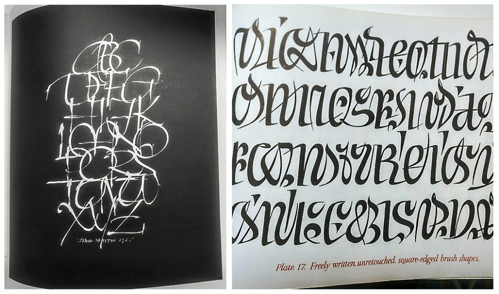
Such innate beauty is a property of all human writing, which employs the fundamental themes of repetition, variation and symmetry, best expressed as rhythm.
This is not to argue that calligraphy does not possess a fundamental beauty, distinct from a culturally learned conception built on associations and fashions. While unprovable and even controversial, Deep Design argues for a innate beauty-sense, as universal among humans as grammatical language.
Our attraction to calligraphy even in unfamiliar scripts points to more than our love of rhythmic patterns. It also suggests that our awareness of the presence of words.`
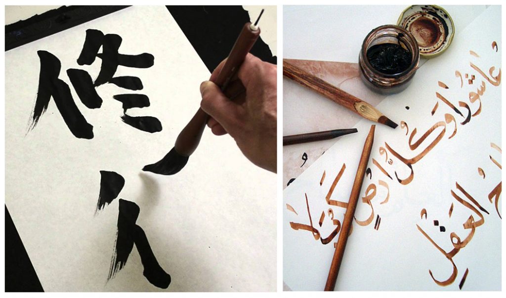
Such innate beauty is a property of all human writing, which employs the fundamental themes of repetition, variation and symmetry, best expressed as rhythm. Each stroke spaced in a rhythmic manner is as important as in music, which employs intervals of time and tone in specific, near-universal ways. Calligraphy can employ these with great freedom, taking liberties with legibility. Thus we can delight in Japanese or Arabic calligraphy without reading a word of it, our visual systems pleasured by the arrangement of strokes as abstract patterns. This script-agnostic pleasure is the nearest we can come to testing the notion of innate beauty.
Yet this explanation needs further questioning. If the rhythm of strokes is appealing, would we respond with as much delight to a pattern of strokes and lines, arranged in beguiling ways? We do respond, but calligraphy has a peculiar additional pull.
Eastern calligraphy, such as those of the Islamicate worlds of Arabic, and the Chinese and Japanese traditions, has a distinct spiritual dimension, separate from its functional role as the scriveners craft.
Our attraction to calligraphy even in unfamiliar scripts points to more than our love of rhythmic patterns. It also suggests that our awareness of the presence of words. and thus, of a transmission of meaning, is a crucial layer of our affection. It’s got to be words. (Many of the patrons of the great books were not literate, Akbar among them.)
Eastern calligraphy, such as those of the Islamicate worlds of Arabic, and the Chinese and Japanese traditions, has a distinct spiritual dimension, separate from its functional role as the scriveners craft. The act of calligraphy, and the adoration of it by the viewer is an encounter both with the deep self and with divinity. The spirit enters into the body of the writer, and influences the pen or brush, the ink and the word; the finished result critiqued in terms of the writer’s ‘energy’.
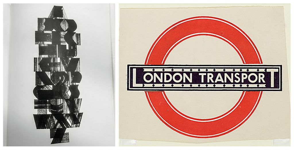
The revival of western calligraphy as a vastly popular artform may well owe to Edward Johnston, an early 20th century scholar of traditional lettering, typographer and teacher. Johnston drew (not wrote) the Underground letter, the first typeface to be used for signage in the London Underground, and the roundel logo still uses it. Johnston distilled the principles of calligraphy, specifically the broad edged tool as a guide to modern letterforms, and is deeply influential in modern typography. Calligraphy is an unparalleled tool for a student to unlock the deep design of typographic form.
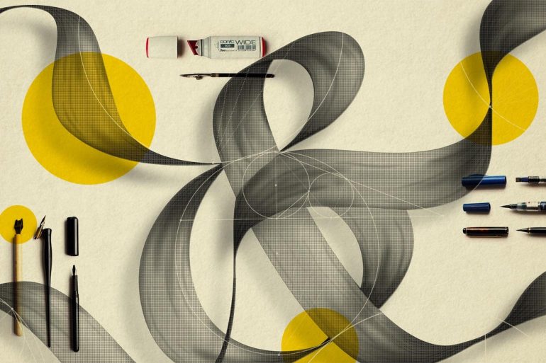
So, since the 1920s, calligraphy fountain pens and felt pens and tools of all kinds are widely available along with an array of materials to satisfy any modern medievalist. That odd oxymoron contains a point.
We relate to calligraphy because we can read it, but not only. When we practise it, we traverse the ages. We connect with manual skill, smell ink and feel paper.
The quickest way to sample the popularity, vitality and sheer variety of this art form is a visit to Pinterest or Instagram. Notice that the reference to the traditional letterform is never far away, despite the sassy one-liners, funky inks and millennial sensibility. The earlier comparison with music can be extended: like classical music and jazz, calligraphy is a living tradition. It recalls, exploits, and ceaselessly remixes an idealised exemplar from the past. Calligraphy is being performed, and it’s forever young.
We relate to calligraphy because we can read it, but not only. When we practise it, we traverse the ages. We connect with manual skill, smell ink and feel paper. We gain social currency by writing well, but we can also experience its meditative effect and its spiritual side. We can be humorous, silly or profound, with nothing more than the interplay of words and how they are written. Stuck for words? Use the alphabet, Deep Design’s favourite 26-letter shloka. Go to a good stationery store, or online, buy some cool gear and have a go. It’s as human you’ll ever be.
**
Itu Chaudhuri a principal at Itu Chaudhuri Design. He writes broadly on design, taking in connected subjects. This piece was first published in a slightly modified form in Business Standard in a fortnightly column called Deep Design.