
For our 5th episode in the series, Those Who Design, I wanted to visit a field of design where the output may not necessarily be tangibly built like architecture or a product but rather be able to comprehensively capture ideas around identity, persona or just a resonating feeling. We invited the passionate and affable Rajesh Dahiya of Codesign to give us a better understanding of graphic design and its far-reaching ability to not only make a transformative impact but do so in a way where individual and collective associations for values are resonant with visualized meaning over time.
Dahiya is a curious sponge for values and cues with a brilliant editing mind to distil meaning and communicate it effectively and sensitively for brands across multiple sectors. In our chat, he mischievously chides that while designers have been using Design Thinking forever, they just may not have been smart enough to coin the term perhaps because it is second nature to them. Dahiya shares that while the output may just be a few lines on paper, some colour, text, a logo or a visual system, it is one that has embedded usefulness in that it needs to be amenable for production in various sizes and formats across intangible and tangible channels for effective communication.
For CoDesign as a practice, ‘the sum total of an experience should be Indian’.
The amenability of graphic or communication design to intangibly manifest in brand, identity, form and function for a product or service seems to be highly malleable across sectors, geographies and genres. Royal Enfield for example was a British brand which is now exclusively Indian with not only a cult local audience but is also being exported back to Britain and elsewhere in the world as Indian-made. What then of the idea of Design in India, I asked Dahiya? He prefaces his answer with the fact that on numerous occasions whilst presenting their work overseas they always get the ‘great job!’ however with the proverbial ‘but’ of ‘doesn’t look Indian?’ Away from the expectations of the obvious splashes of colour and ornamentation, Dahiya explains that India is vastly diverse where design inspiration and solutions for them typically emerge from localization and application akin to form following function. For CoDesign as a practice, ‘the sum total of an experience should be Indian’.
Excepts from conversation between Rajesh Dahiya and Anubhav Gupta
Looking back Dahiya shares that Indian companies first looked at graphic design seriously in the ’70s-’80s after the JVs ceased to exist, however early ’90s communication design was soon dominated by advertising firms with a campaign-based approach and lesser attention paid to brand, identity and meaning. During this time made/designed in Italy and Japan brands changed export markets for the two countries as India lagged behind. Today, he believes that the IT sector has rapidly taken on a sort of ‘design first’ approach for India where designers are being hired at the same time as engineers to ensure for experience. Looking forward, Dahiya is optimistic about the evolution of the Design in India tag.
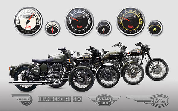
Moving on to Royal Enfield, Dahiya shares an endearing and fascinating story about how the project came into being. An email from Eicher motors without any cues to the incredibly involved meetings with Siddharth Lal, the owner who essentially was first looking for the right value match for his passion project. Dahiya elaborated that most of the time was not spent on laptops or discussing what they will do but rather with lots of reading and slow cooking of what they were thinking. Perhaps in part owing to the fact that Dahiya himself was a Royal Enfield biker since 2001, he decided that this unique opportunity in 2012 is something he is not going to let go off especially to other international competitors, particularly from London. That unique value match most likely materialized also by the fact that most members of his studio had either ridden or owned a Royal Enfield at some point in their lives which brought both heart and passion to their preparations — a fact he remembers sharing with Siddhartha Lal in one of their last meetings. Fast forward to Codesign’s book launch at the British Council where Dahiya reminisces whilst carrying a chair on his head and first learning of their appointment literally broadening his shoulders and containing their excitement between the launch which now seemed somewhat tepid in contrast to the responsibility for Royal Enfield’s new brand identity to life.
![]()
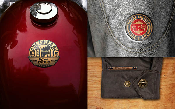
I asked Dahiya about the big moves which among other aspects characterizes the new Royal Enfield logo. The idea of pure motorcycling, British heritage, Indian pride and an international lifestyle broadly characterized the new brief. On the actual logo design, Dahiya uses an analogy of cooking and tasting to check for the sweet spot where in the perfect final dish one cannot distinguish between the ingredients that make it so. He shares that the sweet spot or epiphany came with the word ‘flow’ which helped the team break their own biases to connect all the dots seamlessly. The somewhat Victorian font with subtle flowing new curves, a throwback to the old brand colours of red and gold, and, an overall composition which is balanced despite lacking typical symmetry either in long format or one word below the other would poetically stand for Royal Enfield’s reimagined new strength to bring of pure motorcycling as a lifestyle to its new audience.
Motorcycling for me is about a feeling – the Royal Enfield brand delivers this with a flow in so many ways.
I have to agree with Dahiya to a large extent in that Codesign got it right and the wordmark flows for me. I am a biker myself with particular interest in vintage motorcycles of the same era albeit from another competing British manufacturer. Motorcycling for me is about a feeling – the Royal Enfield brand delivers this with a flow in so many ways. On a moving motorcycle, I can hardly tell if the original logo has been tampered with while on closer stationary inspection, it reveals its new sensual flowing identity. I can imagine it on a fluttering flag reminiscent of the golden age of 50s-60s British motorcycling. With this refreshed younger identity, I somehow feel patriotic about preserving and reviving this brand in India for the world to enjoy. Every time I ride a Royal Enfield, I feel at one with the machine, its flow and the wind brushing past my hair which reminds me of Dahiya’s anecdote during his research phase in speaking to hardcore RE loyalists – Kya yeh bike dheere chalti hai? Nahi yeh araam se chalti hai! To me that is flow. However, with so many different revival stories like Jawa, BSA, Norton in the same space and by Indian owners, I wonder how brand identity, meaning and stories will be different.
When I put Dahiya in the critic’s chair he humbly shares that they could have anticipated the success of the brand to create a wider brand architecture and systemize an agile system of deployment owing to the growth of Royal Enfield’s portfolio and its current expanding touchpoints. His learnings are coming from the technology space where CoDesign has used a systems approach to look at rapid deployment delivery across multiple touchpoints in a single day whilst ensuring a very intelligent and agile back end. Dahiya also elaborates that the technology sector comes with real time data in being able to effectively quantify for impact in what works and what does not — a tool he would like to carry to other sectors in their work.
***
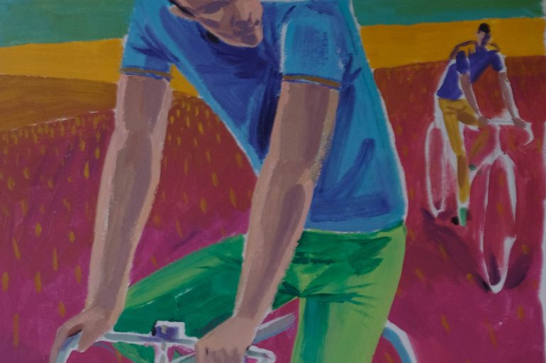
Feature image courtesy: Studio Vikhroli where this was painted by artist and illustrator Sameer Kulavoor.