
Since last year, most people—even those hesitant to be on the Internet—have been compelled to inhabit the digital world on account of a deadly, contagious virus. People of varied nationalities, cultures and languages have been connecting with their families, peers and colleagues through videos, audio, and—the most common—text based communicating services. So much of information is being read and shared on the digital devices everyday. But for a rich, multicultural and diverse space that the Internet is, we have a very limited collection of fonts and typefaces are very limited. Particularly, there is a dearth of multilingual, multi-script typefaces for people of different cultures and languages.
To address this gap, four type professionals came together to create typefaces that reflect their deep understanding of different cultures, and their expertise in designing typefaces in different scripts. Kostas Bartsokas, Mohamad Dakak, Pria Ravichandran and Jason Harcombe founded Foundry5 (F5) to create type and typography solutions for our hyperconnected, global world.
F5 already has some great fonts in their library that they will be releasing these slowly. The foundry was launched on June 1st this year with their award-winning type family, Jali, designed by Mohamad Dakak or Mo, a type designer and PhD researcher who has worked as a graphic designer in the Middle East and specialises in Arabic type design. He is in the final stages of his PhD on Diversity in Arabic Type Styles: Its Emergence, Its Current Status and Its Influence on Arab Readership at their alma mater. Jali started as a graduation project motivated by the lack of Arabic typefaces which could be used in signages.
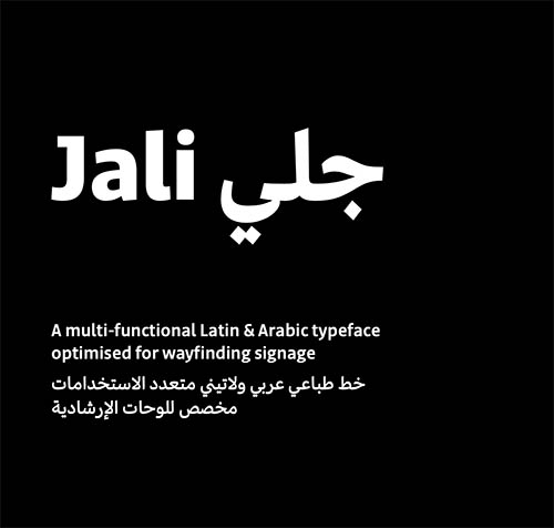
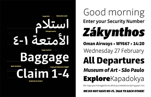
“The name ‘Jali’ means clear in the Arabic language. The design of Jali reflects the ethos of its name. The combination of low-contrast strokes, ample counters, dots, and distinguishable marks make Jali a versatile typeface. With its clear letterforms, Jali aims at offering a warm and efficient reading experience. Similar to other wayfinding type families, Jali is also well suited for demanding typographic environments,” said Ravichandran. Jali is a ‘wayfinding’ typeface and is characterized by its clarity and easy readability. Wayfinding fonts need to be clear and legible when one has only a few seconds to grasp what is written. “This can be approached from a design perspective by ensuring that counters are large, the width is nice, the letters are sufficiently differntiated etc. However, wayfinding fonts in scripts apart from Latin are lacking. We wish to tackle this, as everyone deserves easy communication,” said Ravichandran.
The project was later expanded to make the type family in both Arabic and Latin scripts. The redesign of the Latin received an extensive review from Prof Gerry Leonidas, an accomplished type designer and teacher at University of Reading. Jali received two prestigious awards—TDC Certificate in Typographic Excellence and Granshan’s 1st Prize, Arabic & Latin Category in 2019. Erik Spiekermann, a printer and an authority in type design, will be printing 100 limited edition posters of Jali, and will also feature F5’s typefaces in the forthcoming edition of his book. (Spiekermann’s two typefaces, FF Meta and ITC Officina, are considered modern classics.)
Greek and Cyrillic extension: Kostas Bartsokas
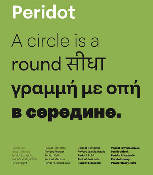
Script support: Cyrillic, Devanagari, Greek, & Latin
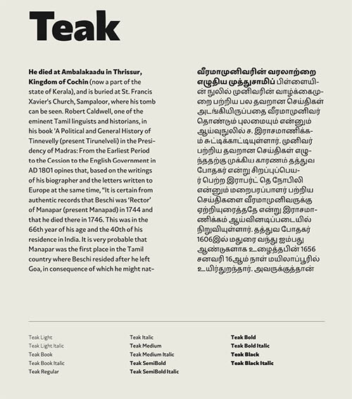
Ravichandran completed her Masters in Typeface Design at the University of Reading, and her Ph.D. on The Development of Typographic Forms for the Kannada and Telugu Scripts. She has held the position of Chief Design Officer at URW Typefoundry (now a part of Monotype). Her design practice is focused on South Indian scripts. F5 will be releasing more typefaces soon, among them will be many styles in Indian linguistic systems: Peridot, a typeface designed by Ravichandran, will also have Devanagari, and Teak (another typeface designed by her) will have Tamil. “However, we are going for a small Latin library, and we hope in the due course we will be able to support all Indian scripts for all fonts we release. Also, we will be collaborating with other designers,” Pria said.
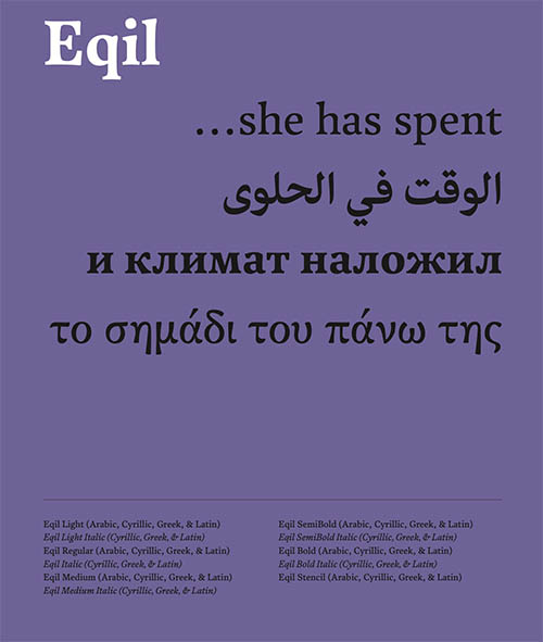
Script support: Arabic, Cyrillic, Greek, & Latin
Eqil, a font designed by Kostas Bartsokas, set to be released in 2022, has also won the Granshan 1st Prize 2016 in Cyrillic and Latin Category. Bartsokas is a type designer and font engineer who has created original typefaces and has been expanding script support to Greek and Cyrillic.
We will be looking out for some great fonts, specifically South Indian typefaces coming out of this foundry.
***