
Dear Reader,
Several years ago I had the honour and privilege of talking to and meeting some of you at Designyatra in Mumbai. Being in Mumbai opened my eyes as wide as I used to open them as a child. The colours of everything from people’s eyes to the colours of the streets brought colour alive again.
I remember particularly seeing the astonishing range of colours in a public laundry that I visited and the stunning colours of the saris worn so elegantly by whom I believe are the world’s most elegant and beautiful women. Just walking or driving in Mumbai is a feast of colour, to my eyes, only equalled by some African countries and Mexico. Of course there are places like fruit markets, meat and fish markets and street markets all around the world, and most of those are still ‘design free’ and untouched by the clichés and rationalities that are so often imposed on the world by professional design.
Many years ago I was sitting on a sofa with an American friend in an apartment in a Victorian block of flats in London. It was a lazy autumn afternoon and we were discussing the million shades of colour of the leaves on the trees outside the window. We were talking about Timothy Leary. He was an American psychologist and writer, known for his advocacy of psychedelic drugs. In particular LSD or Lysergic Acid Diethylamide. I was curious. My friend had two tiny little orange capsules, a fantastic shade of orange. He said, he’d been given them by Dr Owsley, known as the LSD “cook” or underground chemist. Under the professional name of “Bear”, Owsley worked with the psychedelic rock band the Grateful Dead‘s international fan “family”. I was a fan of the “Dead” and they had even rehearsed once in our basement at Wolff Olins. I became so curious that I decided to try taking a capsule.
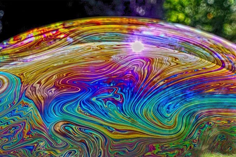
Nothing happened for forty minutes and then ‘white’ came through the Venetian blinds and covered all the surfaces in the room. I’m talking to you about white because I’d never seen such a vivid white before and I haven’t seen one since. But now I know it exists. I’ve stared at halogen and photographic lights, I’ve enjoyed the thousands of whites of paper, but I’ve never seen white like that. That was the gift that this experience gave me. It’s not an experience that I’ve tried again nor is it one I would recommend, but it opened my mind to colour and how it’s much more than something you see.
I’m writing to you in particular, thanking you for letting my letter into your mind, and inviting you to think about colour again, and how you feel it and use it to delight and entice people with your work.
Once I had a client who’s company was called Green Square. He wanted to find the right shade of green. He had no interest in Pantone’s shades, so he asked me to fly to Montvale in the USA and to spend a day with him in his garden looking for the right green and then finding out how to mix it as paint, as inks of various sorts and as dyes. Together we created ‘his green’. Looking at the language of greens, which sounds better to you; Hunter Green, Honeydew, Moss Green, Myrtle, Olive Green, Forest Green, Lime Green, Emerald, Jade, Apple Green, Viridian, Spring Bud Green, Shamrock Green, Kelly Green, Verdi Gris, Sap Green, Pine Green and Avocado Green or simply a series of numbers? Which opens the mind?
Try taking one colour and one day and spend time seeing how many shades of it you see in a fruit market, or a city or a river. Close your eyes and see how many greens you can see. In the UK we’ve changed the bulbs in our green traffic lights and I hadn’t noticed how pale they’ve become until I saw the huge traffic lights in Novosibirsk, the capitol city of Siberia. Those are seriously green, the brightest green you can imagine, the green that I knew as a baby seeing colour for the first time, the green of Babar the elephant’s suit.
Choose an orange from a heap of oranges and look intensely at it. Why did you choose that orange? Was it that orange-ness of that particular orange that spoke to you? Enjoy the texture and the smell and how they both intensify as you peel your orange and reveal its marvellous globe of segments. Colour is among the greatest beauties and wonders of our world. It’s not just something to specify, it’s something to relish.
I talk about the muscles I use as a designer and have spent much of my life developing. The first is my muscle of curiosity, the second is my muscle of appreciation and the third is my muscle of imagination.
With my second muscle, at some point during each day of my life, I appreciate a particular colour that speaks to me. It could be the yellow beak of a blackbird or its sleek black feathers. It could be the rust red of a fox walking past my window. It could be the thousand shades of colour in the eye of a friend, or the colours of the changing light of a day. There’s always something new to learn when you appreciate and taste the magic of colour. If you’re a designer then keep your appreciation turned on.
Colourful days and best wishes,
——————————————————————————————————————
 Recognised as one of the world’s most experienced practitioners in establishing corporate identities, Michael’s body of work has spanned more than 30 years. He enjoys encountering situations where he doesn’t know what to do or think. That’s when he needs, and so far, can count on, his creativity. Most of all, he enjoys old friends and new ideas. He is a regular columnist for Kyoorius Magazine.