
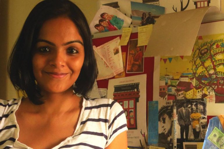
A baby cousin of mine once asked me to draw her a peacock. And I had to draw it thirteen times, till she finally approved of it. “The tail could be longer”, and “the peacock should be looking happier”, “and make it dance in the rain but also feel cold at the same time” were a few of the many things she demanded from that tiny illustration. Priya Kuriyan, an independent animation filmmaker and illustrator based in Delhi, has done many design projects for children, including Sesame Street (Galli galli sim sim), where she directed educational films for kids, Maya Saves The Day by Mira Nair, Where is Gola’s Home by Chitra Soundar and more. If you’ve bought any Ruskin Bond novels recently, there’s a good chance Priya designed the covers.
So we decided to ask Priya her story, to find out what inspires her. Below is an excerpt from that conversation.
Are there any stories/ illustrations from your childhood which influenced you?
Like any kid who grew up in the 80’s in India, I read a lot of Russian picture books that were available then. There was also this illustrated Russian magazine called ‘Misha‘ that I would borrow from libraries. ‘Mad comics‘ were devoured once in a while, but it was difficult to spot them. My parents subscribed to ‘Target‘, a magazine for children that had fantastic original content by Indian writers and Illustrators. I was completely awed by Ajit Ninan, Jayanto Banerjee Suddhasattwa Basu‘s and Atanu Roy‘s art in it. All I wanted then, was to have a job like theirs when I grew up. I still have home- bound editions of the same magazines. I still remember books by Pulak Biswas and Manjula Padmanabhan that left an indelible impression on me. Then off course, there were the comics like Asterix and Tintin which again had to be borrowed from libraries or a kind cousin since they were so expensive.
What are the things you keep in mind while illustrating for kids?
I try avoiding cliches, especially when it comes to creating characters. I like thinking of the character’s back-story before designing it: How does the character spend his or her day? Is he/she a bollywood fan? What kind of food does he/she like to eat? Some of this stuff that might seem irrelevant, but really helps making the character unique and endearing.I think the devil is definitely in the details and therefore, I try and include subtle layers of information in my illustrations, so that a kid can come back to it again and again, and perhaps spot something new each time he or she looks at a page; it could be a side joke which might not be part of the text, but, at the same time, it might spur them into creating a parallel story of their own. So, if one is illustrating to a piece of text for a picture book, it’s important that the illustrator takes things beyond what is obviously there in the text.
I try and also keep in mind that my audiences’ experience of the world is mostly limited to the last 8 to 10 years as opposed to the last 20. So, if I choose to reference something from popular culture, or use some visual metaphors in my work, I have to do it carefully. That being said, some of the best children’s books are those that can also be enjoyed by adults as well and can be interpreted on different levels.
Who or what are your artistic influences if any?
Apart from the artists that I mentioned above, I love the work of illustrators like Shaun Tan, Emily Gravett, Jon Klassen,Quentin Blake and more. Graphic novelists like Marjane Satrapi, Alison Bechdel, Kate Beaton are huge inspirations and of course, I’ve always wanted to be able to draw like like Toulouse Lautrec and Egon Schiele. My work, I’ve realised, is also heavily inspired by Indian folk art like Gond and Madhubani. I always enjoy going through Mughal miniature paintings.
How is designing a book cover different?
The book cover is the first thing the customer sees – it shoulders the responsibility of catching the first attention. That’s why it should be interesting enough for the person to pick up the book and see what’s inside. The cover should tell the story inside the book, but not too much of it either. Hence maintaining that balance is extremely important. And knowing how much of the story to give away in the cover. Also, capturing the correct image from the story – the right moment of it, becomes very crucial in book cover design.
Have you come across any book covers recently, that you thought were exceptional?
A few I can think of immediately are Quiet by Susan Cain. Its simplicity captures your attention and conveys effectively what the book is about. Then there are a few Penguin Classics like Feluda and Charles Dickens that one would want to buy just to make their bookshelf pop! Zubaan books’ covers for their academic section. These covers extremely sophisticated looking and reflect the cerebral content of these books well. I love Archana’s (Sreenivasan) cover for Teresa’s man and Prabha’s (Mallya) cover for Tales of Fostergunj, They capture the essence of the places these stories are set in so well!
There is a certain languid quality in Archana’s illustration of Goa which is lovely and one can almost smell the crisp mountain air in Prabha’s. And lastly, The Silent History. It conveyed the slightly disturbing dystopian theme quite well. Definitely something that would catch ones eye.
Priya is currently working on a project with BBC and is also creating her first picture book as a writer and Illustrator. More of her work can be found here.
**