Editor’s note: This article was published in Thoughts, a blog maintained by Michael Johnson at Johnsonbanks.co.uk, in January 2018.
There’s been quite a hoo-ha online about this week’s revelation that the new Formula 1 logo, unveiled last November at the Abu Dhabi grand prix, looks remarkably similar to that used by a 3M brand of, er, compression tights. It doesn’t help, of course, that the new F1 logo replaced one that had existed for years, and whilst it was showing its age a little, last year’s change had already caused quite a stir. The knives were out, sharpened, and ready.

Lo and behold, thousands of online experts are throwing the book at Formula 1 and its logo’s creators, advertising agency Wieden + Kennedy, accusing them of everything from unoriginal thinking, not doing their homework properly or being unable to do ‘a simple Google search’.
Reading through this commentary, it’s clear that many people simply don’t understand the deeper legal questions and complexities around trademarking. What follows is an attempt to highlight some of the recurring issues.
What steps do you need to go through?
Firstly, for new brands, a name needs to be found, agreed and then a registration filed for. Secondly, a visual mark needs to be designed and another application made.
So that symbol on your screen may be the greatest thing you’ve ever designed or commissioned but until its verbal and visual registrations have been filed — and accepted — in the eyes of the law, there’s nothing to stop something similar appearing out there.
So use the F1 case as an example, even if Wieden’s in-house team designed their logo in January 2017 (a month before 3M filed their trademark application), theirs wasn’t seen by anyone publically until November. Legally, no contest.
Aren’t there multiple categories?
Yes. There are 45 different classes of goods and services within which names are checked, then 29 broad image classifications (with multiple sub-sets within each of these). When you’ve created a new symbol or logotype, it’s smart to check that it doesn’t clash with anything in the same or related classes — then even smarter to register it in those that cover what you do, or plan to do, in the next few years.
We’re currently working for a global NGO and are checking the final two shortlisted designs across four key classes and multiple visual categories — before a final design decision is made. The chances of one dropping out are high — so we are simply protecting ourselves and our client. A global brand such as MasterCard is classed as a ‘famous trademark’ and is registered in 23 different classes — which isn’t unusual for a global brand.
As far as we can see, in the F1 example, 3M’s design is registered in a medical clothing category, whilst the motorsports brand has filed multiple applications, including general clothing. So, close, but technically different. Incidentally, just to search for similar designs, across all categories, worldwide, would take weeks and cost hundreds of thousands.
How do you know if your logo is unique?
Well, until you do these searches, the simple answer is — you don’t.
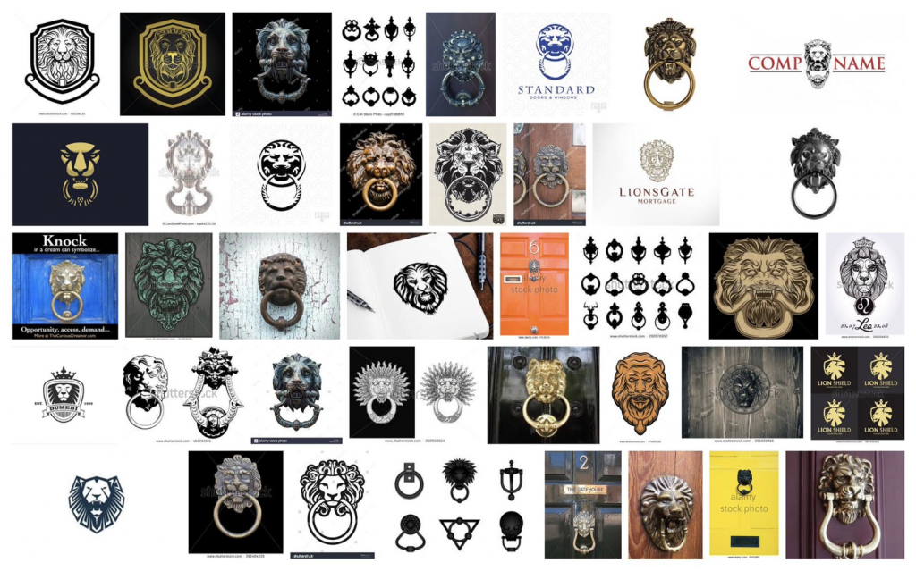
There are, of course, some easy first steps. Last year we were investigating an idea for a symbol based on a door knocker. One of the client team asked if we could consider a version based on a lion’s head — until a quick Google image search demonstrated the sheer ubiquity of this idea. The fact that only a month later the British ultra-right political party UKIP unveiled their very own lion was a factor too.
Another useful method is surrounding yourself with reference material, books and possibly grey-haired people with still functioning long-term memories. It’s painful when someone points out a similarity, but it needs to be done. Take it on the chin, move on.
And from the outset, it helps if you aspire for something new and search as widely as possible for your inspiration. If a designer’s ideas come only from logo and symbol books, neatly arranged in useful categories to ‘lift’ ideas from, then the chances are they will design something borrowed, not new.
What happens when something is too close?
There are many examples of organisations haggling over the same name and area of business. Apple Corps (owned by The Beatles) and Apple Computers may have different logos, but their dispute over trademark infringement began in 1978 and dragged on for decades.
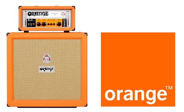
It involved multiple court cases and pay-outs, principally because Apple Corps retained the rights to “creative works whose principal content is music” — until a rumoured $500 million buyout finally saw The Beatles arrive on iTunes. One can only imagine that at some point Orange amplifiers and Orange phones must have had a similar form of discussion about their shared name, and shared colour.
As for when a symbol ‘looks’ too close, this is where copyright can act as protection, to a degree. The European Court of Justice ruled in 2008 that trademarks are “protected by a basic rule which prevents the registration or use of a sign identical or similar to a registered trademark, for goods or services identical or similar to those for which the mark is registered.” This is the killer precedent around which 3M’s lawyers will be circling their wagons, since both parties wish to sell clothing, and the marks are uncannily similar.
If it’s ‘out there’, don’t we own it?
Well, it depends. To claim a ‘level of distinctiveness’, it’s usually down to time, and the rule of thumb is seven years. Use a logo for that amount of time, consistently, that people can see and recognise and you begin to establish some ownership of that idea. There are certain ways around this, usually for global brands that can establish a new ‘look’ quite fast. British TV channel, Channel Four, were initially faced with issues because on paper, ‘channel four’ is a generic name, so inherently hard to register. But they were granted an exemption because they were quickly able to demonstrate ownership, and this is where F1 will be able to argue that even after just two months, they have some ‘recognition’.
Meanwhile, for all those disgruntled designers linking to logos that lie deep in their portfolio websites when they feel a rebrand has borrowed their ideas? The harsh truth is that those designs a) aren’t registered and b) haven’t been seen consistently enough, in public, to make a defensible claim.
Is a logotype easier to register?
One of the reasons why customised pieces of typography (i.e. logotypes) have long been popular for organisations is that they are inherently easier to protect. By definition, the name has already been dealt with, it’s just a question of forming a unique arrangement of letters. Citi? Four letters and a red arc. Fedex? Just five letters, one typeface and two colours (and an invisible symbol — now that might be tough to register).
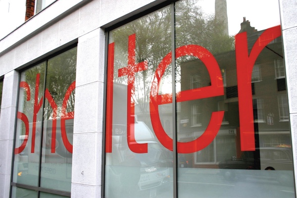
Johnson Banks’ Shelter logo has just one element that makes it unique — it’s rooved ‘h’ — but that’s all that’s needed. Interestingly, when originally designed 14 years ago, we were advised NOT to remove the ‘h’ and use it as a stand-alone symbol. But now that recognition has been established, and enough time has passed? We probably could.

What about shapes and holding devices?
The more generic and geometric a shape gets, the harder they become to register successfully. Therefore Mastercard, with their two interlocking circles, need to be ultra-diligent with the way they use their mark because there are hundreds of other, similar marques. It’s basically impossible to ‘own’ a shape that’s deemed generic — so squares, circles, triangles, etc. It’s what you do with, or within, the shape, that adds the distinctiveness that can be registered.
As an example, we were warned that the holding shape for our Christian Aid logo (designed to hint at an envelope) wasn’t sufficiently ‘envelopey’ enough when standing alone. As it happens, we were fine with that, because wanted it to be an arrow, a blood bag, or filled with compost at certain times in the future.
Are there other ways to check if a logo is unique or not?
Currently, you can check available online databases — if you train yourself how to use them — but our advice is to get professional help. It can take days to check just a few categories, and could involve looking at thirty to forty thousand marks. Open the World Intellectual Property database and you will see that there are nearly 34 million items to search! It’s highly skilled, and not for the faint-hearted. And as branding becomes increasingly global, this issue isn’t going to go away.
Johnson Banks did effectively ‘outsource’ the intellectual property checks of our Mozilla project to the public – because Mozillians and coders the world over gleefully posted examples online of logos deemed too close to those we had proposed. This, of course, was infuriating at the time, but in the long run? It was better to know early, rather than late. And of course, saved embarrassment for both us and our client.
Where does this leave fast cars and hosiery?
Well, we’re going to assume that the agency’s design team didn’t suddenly start wearing support stockings early last year, so this probably begins with an unfortunate case of ‘similar designs, same year’. Some would argue that the chosen design route is just too obvious to have NOT been done before — a curved ‘F’ for speed, lines in the road? Perhaps.
However, we’ve had our fingers burned too many times by this process NOT to trademark check before going public. The question remains, did the agency, or the client’s legal team, do their diligence, and were they thorough enough? Should they have shortlisted their favourite two or three, checked, then made their decision?
That’s what we’d recommend. It’s pricey in the immediate term, and yes, it could knock a design favourite out of the running. But that’s nothing compared to the settlement fee that 3M’s expensively assembled legal team are now thinking of.
***
Michael Johnson is one of the most influential designers in the world. He oversees the strategic and creative output at Johnson Banks, a design firm he founded in 1992. For over a decade, Johnson edited the Thought for the Week blog (now to be found on Johnson Banks website under Thoughts, under which, this article was first published). The article has been reproduced here (both text and images) with his permission. You can read more of Johnson’s writings here.

