This article is the third in a series of articles featuring movie posters from across India, released and unreleased works too, for their merit. Keep watching this series for more.
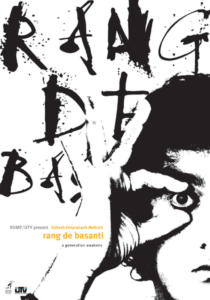
When we spoke to Sucharita Sengupta Suri, a graduate of NID and the creative think-tank of Seek Red, about Rang De Basanti (RDB), we got to know that the four posters of RDB had different concepts.
“When Rakeysh [Omprakash Mehra, the director] told me that whatever I do, we must convey the spirit of RDB in one frame without any supporting text or by line or a writeup, I was happy because Rakeysh believed that I could do this. [Later, for other reasons, the tagline ‘a generation awakens’ was added.] To me, it was clear from Day Zero that RDB is about Youth — their aspirations, camaraderie, philosophy and struggles. This needs to be reflected also in the logo of the film.”
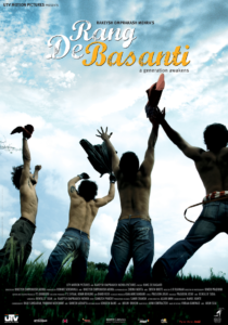
The film itself has two faces — one contemporary and one period. The latter part was meant as a surprise for the audience in theatres and therefore, the posters have only a contemporary tone. About the designs, Sucharita shares, “when I presented the first poster [teaser] where the 4 boys jump to catch the aeroplane, the distributors returned it saying it didn’t capture the cast or production value of the film. But the makers had the foresight and finally it was used at their insistence. Today, that poster is the most remembered artwork from RDB.”
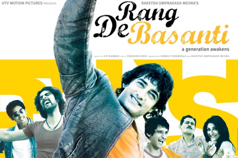
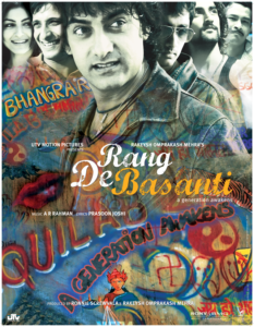
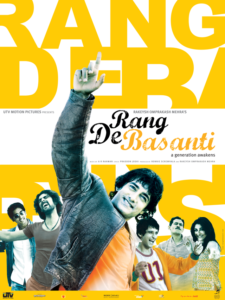
The musical poster was to have a light, happy tone, without losing the spirit of youth for which, “I decided to use images of the characters dancing with a backdrop of the name of the film written boldly in Basanti [saffron] colour.” she says. The poster for Cannes was minimalist, because the audience here was very different. Seek Red went ahead with the simple layout which shows Aamir trying to open his eye literally, representing the tagline — ‘a generation awakens’.
We hope you enjoyed Seek Red’s work. For more, browse through their Behance.
A version of this article was published in Kyoorius 26.

