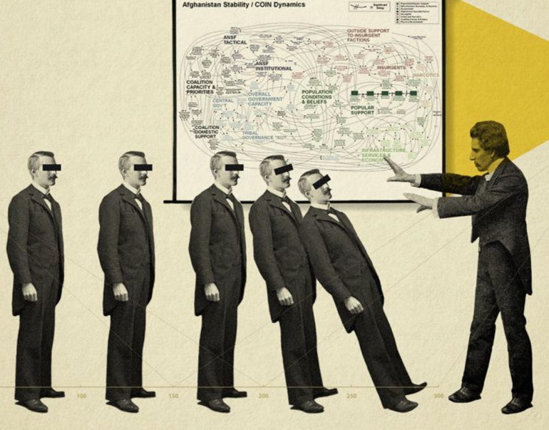
Some innovations succeed to the point of redefining the problem they tackle. Some give way to better ones, or having served their time, fade into the section of the graveyard reserved for the no-longer-needed. Yet others fail flagrantly, and quickly: tagged as laughable, or a good idea poorly executed, or ill timed. A broad consensus rules. Surely it ought to be impossible for an innovation to suffer all of these fates at once? To be a ubiquitous necessity, a permanent, empowering right, a watershed; and yet, a scourge, a threat, and an evil joke. Yet that unlikely status of divider-in-chief has attached itself to Microsoft’s PowerPoint, the class-defining presentation software.
All these fates, bar one: it is not fading. According to a decades old, (unverified) estimate, 30 million presentations are made every day, and take 15 million person-hours to view (15 million people for one hour, for example).
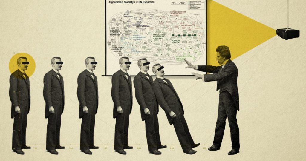
To excavate the deep design of this division, we visit both sides, though not to broker a peace, and we examine precedents and look at human nature for answers. Start by re-emphasising its sheer prevalence, hidden by its everydayness.
At work and play, peace and war, schools, colleges, businesses, armies and governments are in its thrall. When, in 2001, McKinsey presented to PM AB Vajpayee its case for infrastructure spending, newspaper reports actually referred to PowerPoint by name. In 2013, Mickey Arthur, Australian cricket coach dropped his vice captain and three others key players from his Test side for failing to submit presentations on team strategy. Schoolchildren are taught it early, and often are required to submit project work as presentations.
PowerPoint slides were blamed for the vague information that led to the approval of faulty surface tiles on the ill fated space shuttle Columbia… Senior US army officers say that PowerPoint is appropriate for those press briefings where the goal is to not convey information—“hypnotizing chickens” is the operative phrase.
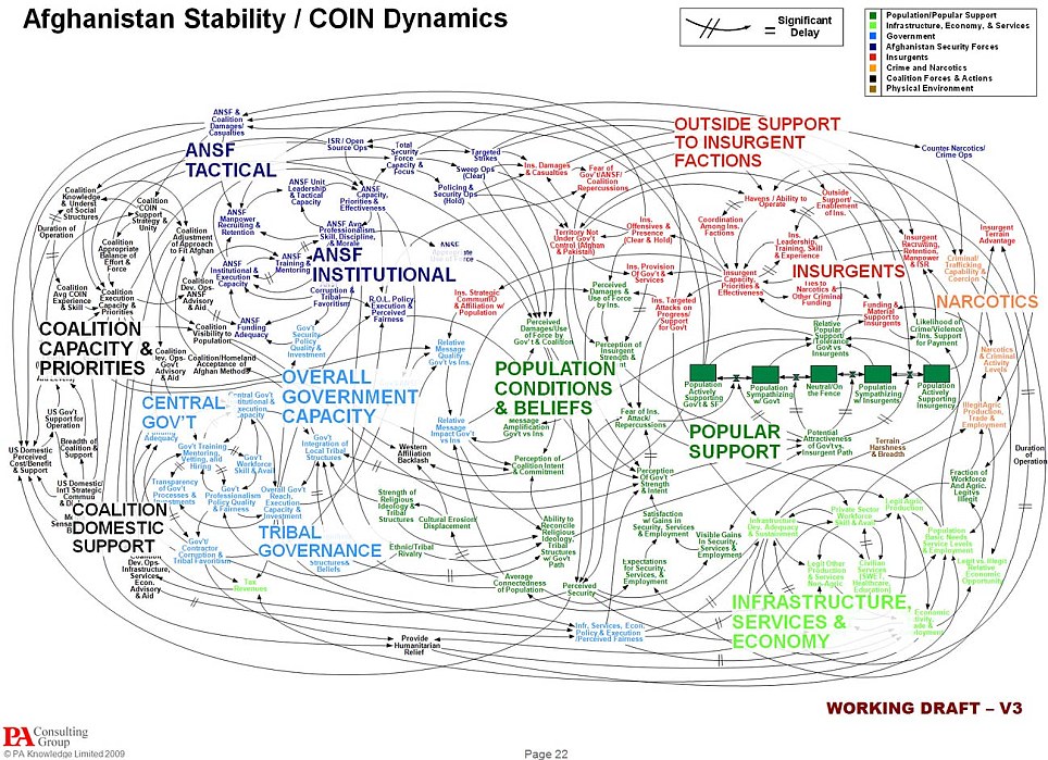
Articles denouncing PowerPoint often quotes the US military, which seems to both rely on it and jeer at it. An article by a US military officer called it ‘Dumb-dumb Bullets”. A slide picturing America’s Afghanistan strategy has become a widely shared joke—the head of US forces famously said, “When we understand that slide, we’ll have won the war.” Another general called it an “internal threat”. Yet both generals use PowerPoint.
To the point, and typical of the criticism, is the second General’s remark that PowerPoint is “dangerous” because of the “illusion of understanding and…control. Some problems in the world are not bulletizable.”
Here’s the holy pope of graphic information visualisation, Edward Tufte: “…the PowerPoint style…disrupts, dominates, and trivializes content. PowerPoint presentations… resemble a school play—very loud, very slow, and very simple.”
It’s fatal simplicity that Tufte’s talking about. PowerPoint slides were blamed for the vague information that led to the approval of faulty surface tiles on the ill fated space shuttle Columbia. A commission led by him concurred: written notes, photographs and data were recommended as both more effective and more efficient. Senior US army officers say that PowerPoint is appropriate for those press briefings where the goal is to not convey information—“hypnotizing chickens” is the operative phrase. And at Harvard, a peer-reviewed, experimental study found PowerPoint no better, and arguably worse, than a talk without presentation aids.
PowerPoint is a watershed in human communication, as much as the open web. It democratised communicative agency: a shy 23 year old accountant could plausibly take on a boardroom.
The Defence, or not quite
Much of the criticism of PowerPoint springs from its strengths. In response, one can argue that any tool can be misused. Its naff graphics, and overwhelming popularity make it an easy target.
The presentation itself is not new—as film slides, or overhead projection. But with its reincarnation as PowerPoint, came an unprecedented level of ease, and impact. PowerPoint is a watershed in human communication, as much as the open web. It democratised communicative agency: a shy 23 year old accountant could plausibly take on a boardroom.
The crisp fonts, graphics, and finish and the ease with which they could be combined weren’t new either: desktop publishing had seen to that. Both give even half baked thoughts the legitimacy of the printed word. But sounds, video and magnification let the presenter dominate the darkened room.
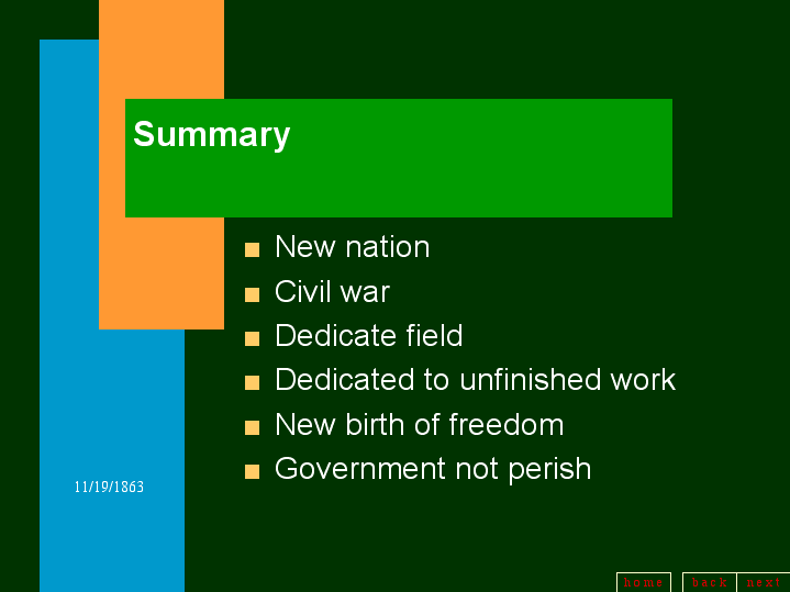
But
In truth, PowerPoint leverages of the evolutionary primacy of sight over hearing, and especially to detect motion. It’s primordial. If it moves, I watch it, to eat it or be eaten. But the monster must be fed: next bullet, next slide, and the next. Presentations steal our attention, but misuse it, leaving a hollow where an idea might have been.
The purely visual, false sense of authority that PowerPoint gives (even to specious logic) is hard to unsee. Bullets and numbered points give a surround-sound of insight. Boxes group incompatible concepts into buckets; and the arrows that connect them don’t just look like they convey causality. No, they are causal, they must be. Slippery word play can take the place of genuine idea formation: use the right font, and bomb the slide. Don’t speak.
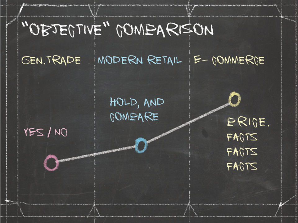
This is the halo effect at work: what looks good must be intelligent and true. In a well studied experiment, when a well-groomed man in a suit tells a group of walkers that it’s okay to cross the road even when the sign says “Don’t Walk”, they follow him.
PowerPoint, in contrast, is the death of rhetoric, unconstrained language and pictures— together, the most potent and ancient ways to convey the complexity of the world.
But the halo effect can cut both ways. We also trust the person with better language, diction and even better handwriting. That’s an evolved bias too, rooted in the idea that language, articulation and writing took time and effort to acquire, as did the confidence to stand before an audience. They are heuristics for genuine learning. Democratisation can wait.
PowerPoint, in contrast, is the death of rhetoric, unconstrained language and pictures— together, the most potent and ancient ways to convey the complexity of the world.
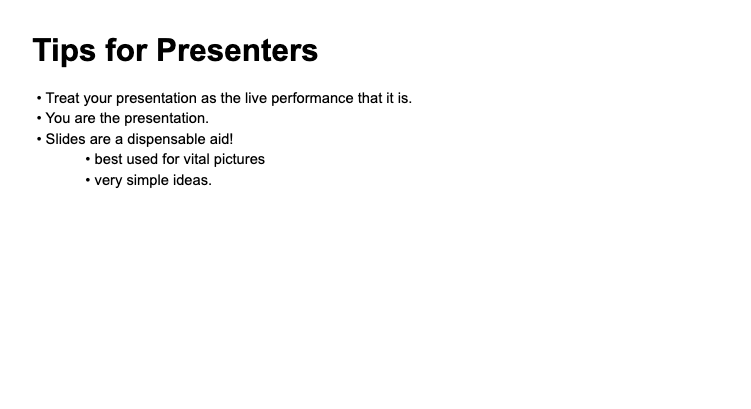
Thanks for listening.
**
Itu Chaudhuri is principal at Itu Chaudhuri Design (ICD). He writes broadly on design, taking in connected subjects.
This was first published in a slightly modified form ‘Design and the future’ in Business Standard in Deep Design, a fortnightly column by Itu Chaudhuri. You can also read this on icdindia.com. All images from ICD.

