Those Who Design series holds a critical lens to the contemporary architecture and design of our country. For the third episode of this series, we sit across Ayaz Basrai of Studio Busride, known to push its limits from mad to insane. Here we try to understand Studio Busride’s philosophy and approach through two of their best known projects, and in the process we get a rich insight on conducting experiments through architecture, long iterations in design and creating spaces without rules. You can check the first episode with Professor Christopher Benninger on building an independent university campus, and with architect Ambrish Arora on building iconic buildings and working with the government.
For the third episode of this series, we invited Ayaz Basrai of Studio Busride to share with us his thinking and their work which departs from modernist linear ways of connecting nodes and ‘making things happen’ towards a more nonlinear renaissance with rhizomatic connections to question the status quo and ‘letting things emerge’. In his own words, their work puts the conventional on top of its head and the outcome sometimes can range from ‘mad to insane.’ Their practice straddles both a research lab which maps culture and possible ‘India Futures’ while their studio uses some of these maps to create compelling social experiments via their designs.
He chides that hospitality tends to guzzle serious money where cheques may be written by ego leaving it difficult for restaurants to break even.
Designing for the hospitality industry
In specifically discussing their Interior Design work, Ayaz reflects on their experiments in hospitality — a significant part of Busride’s portfolio. To address my enquiry of using design for transformation, he shares their work on Smoke House Delhi where one is able to appreciate the deconstruction of ‘Form follows Function’ to ‘Question follows Form’ alongside ‘Culture follows Function’. One is especially struck by the designer’s interest and understanding of what makes a business viable to arrive at the spends one would optimize to create design. He chides that hospitality tends to guzzle serious money where cheques may be written by ego leaving it difficult for restaurants to break even.
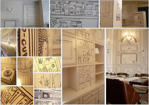
For Smoke House Deli, Ayaz shares that they worked backwards to arrive at a business viable cost of Rs. 250 per sq ft. to create a unique experience as an interesting, culturally sensitive F&B space. Starting with simple grammar of graphic design for story telling; furniture design for cultural cues and a simple fresh white to string it together allowed for things to emerge where each restaurant became a city museum in the story it told and cultural space it represented while maintaining a consistent look and feel. Ayaz insists that in order for things to emerge, one must hold the brief loosely and have respect for ambiguity before one crystallizes it.
One would embark on understanding what it means to be Indian today in order to relate to how Design in India should be discussed as a reflection of our evolving culture.
Why not Design in India?
Ayaz suggests that their practice dabbles at the fringes of culture and draws inspiration from current movements in music, fashion, art and others. He shares that design needs to be nimble and a reflection of our prevalent culture. He playfully asks – where is culture moving? As an example, he shares a movement in the collapse of gender where androgyny is manifesting in various movements including fashion and art with slow cultural inroads into interior design. His enquiry is pertinent to question our linear ways of thinking even if for whimsy to turn it on top of its head to see what might emerge? For a home, we typically design with strong gender stereotypes, something which clearly warrants questioning and that too for a changing India.
Ayaz’s rhizomatic approach is apparent in the way he explains his idea of Design in India. He elaborates that one is part of a complex web of networks which operate at both macro and micro levels. These bring together both global and local constructs in culture offering a rich set of possibilities. For him, one would embark on understanding what it means to be Indian today in order to relate to how Design in India should be discussed as a reflection of our evolving culture.
Excerpts from a conversation between Anubhav Gupta and Ayaz Basrai
The design experiment was led by cathartic and almost therapy like conversations between designers and the client/user – an approach Ayaz thinks is critical to reimagine the possibilities through design.
An experiment—The Folly House
For this conversation, Ayaz chose to discuss an indulgent and autobiographical project (from the client’s perspective)—The Folly House, where he assures me that together with the client, the designers took a hard stance to provoke the status quo. Here the client is also the user. The design experiment was led by cathartic and almost therapy like conversations between designers and the client/user — an approach Ayaz thinks is critical to reimagine the possibilities through design. He believes that sedate projects emerge from sedate relationships — so one has to truly ‘get into bed’ with their clients. He is critical of aesthetic driven design or one where democratically shared images or items can be used to put together spaces. Everything in the Folly House was made and not bought. The client’s shared values and the fact that they did not want their kids to grow up in a space with rules provided the impetus for the big moves. Ayaz insists that they wanted to design relationships not rooms and use objects ‘on demand’ to fulfil functional need or enhance relationships. A large gallery like living space with moving parts for objects like follies in a park where engagement with space is, in Ayaz’s words, like doing cardio to make for iterative relationships rather than be codified on static ones around an idiot box.
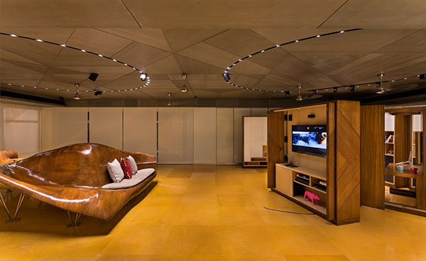
Curiously, our conversation seemed to suggest that a large part of this experiment was specifically around the living space as the rest of the house seemed more static. What struck me as unusual is also the use of moving parts that are typically deployed in small spaces for flexibility in contrast to the large gallery like living space of The Folly House. This large gallery with interesting objects including the central topographical seating device and other moving parts while intriguing, were a fair departure from our typical idea of a home. I wondered about the speed + variety of iteration and its practicality, especially if and how one would use these moving parts on a daily basis and following the age of users in the longer term. When I put Ayaz in a critic’s shoes he candidly shared that there are parts of the house like the gallery which he would not want in his own, but this was a hard stance taken willfully with the client. He reflects that they almost focused too much on the objects themselves and could have structured their thinking with better theoretical references — some of which only emerged as the design organically developed.
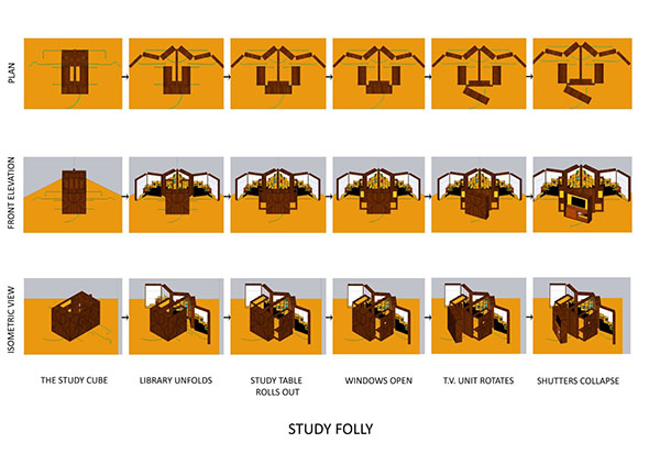
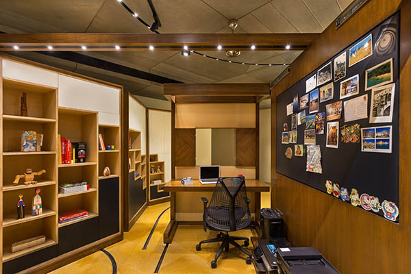
Ayaz accepts the typical critique of the observer almost being intimidated by the movie like set and lighting of the gallery for a living space which begs the question of how far one can truly push the status quo to depart from the sedate or vanilla. While agreeable for this client, in light of this intimidation, the jury is still out if Studio Busride’s quest for designing relationships has been truly met for the clients or for those who critically look at this project for its learnings.
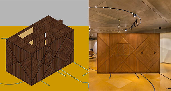
Either way, The Folly House is true to its name and its deliberate attempt to challenge conventional wisdom. Studio Busride’s playful and irreverent ambiguity in close partnership with their clients who are also its users perhaps achieves its purpose. It mocks a critical view and to the naked eye (and true to definition of a Folly), the living space could be a costly ornamental gallery with less practical use littered with ruin like objects in a park. However, this experiment is not an enquiry without incredible effort. This can be seen in the beauty of crafting each object and in their engineering to enable for the intent and speed of iteration which was envisioned to design unique relationships.
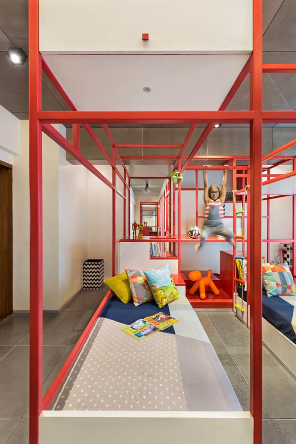
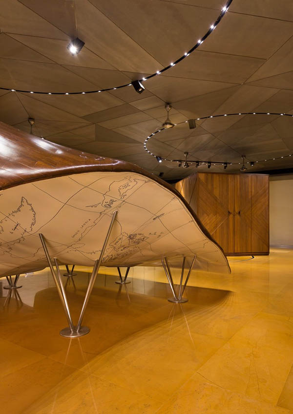
Secret magical moments like the design of the underside of the seating topography into the childrens’ world travel map among others capture the care and inclusion brought about by the intimate relationship forged between the designer and the client to make it truly autobiographical. An autobiography would be impossible to critique objectively without bringing in biased judgement and hence one has to appreciate the authenticity of this process and its inquiry however conventionally atypical and indulgent the outcome — as long as it serves the purpose and expression of its user to partake and live in such an experiment.
This is a brave attempt to perhaps find a genius in the spectrum between somewhat mad to insane whilst challenging the status quo, being authentic to a process, not taking shortcuts and to test the transformative impact of design.
***
Feature image credits: Sameer Kulavoor, DISCOMFORT 4, 2020, Watercolours on acid-free paper, 8 x 6 inches each, Set of 5

