It seems unarguable that designers carry a psychological armoury that makes their work effective. That, not manual skill, is why we trust them with our businesses, or not. Without it, designers would miss their only target: other people.
If you are looking for ways to use psychology to boost the value of your design rupee, go elsewhere. Try one of several excellent web pages on the topic or the tens of shallow ones. You will find them absorbing, but ultimately disappointing. Incorporating formal knowledge into practice is an act of deep learning that designers (should) do.
Yet scarcely a season goes by when some senior designer or other doesn’t have this epiphany: why, why, don’t my junior colleagues understand psychology—it ought to be taught in design school! Resisting the impulse to ask, never mind the juniors, do you get psychology, where did you study it (and can you teach me some?) uncovers this intriguing question. Is psychology’s place in design all important, either as deep background or penetrating insight? Or is it just a source of thumb-rules to be opportunistically summoned to justify a design decision, or simply a curiosity?
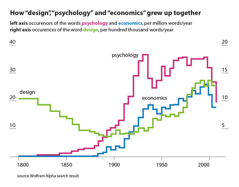
Or perhaps, you say, the question is unfair. Design, like all the arts and humanities, is inherently and implicitly psychological; its practice itself carries all the psychology it needs, and designers learn the psychology as they go. It’s just, you add, that psychology has formed itself into a university discipline, and a new profession, at around the same time that, say, economics and design did, all relatively recently. And take a look at this overlapped view of the historical frequencies of these three words from the computational search engine Wolfram Alpha.

This may have led many disciplines to feel the want of a more explicit understanding of psychology, Some more than others: economics, conspicuously. Never mind those Viennese economists who see their discipline as a branch of psychology, the mind-business empire struck back by whipping up behavioural economics, rescuing economics from the improbably rational thing it is. Since Daniel Kahneman’s 2001 Nobel win, his best selling book has become required reading, spawning a flood of others. Every professional has a pet ‘Cognitive bias’ she loves to quote. Airport bookshop shelves creak with the stuff.
Perhaps design’s greater age as a word-concept (see graph of Wolfram data) reflects its protection against this particular insecurity. Even while suffering from the odd bout of insecurity about a lack of formal knowledge, designers themselves tend to believe the ‘implicit knowledge’ defence (see the second paragraph). Art, for another, expresses no desire to learn psychology.
And there’s the rub. The daily practice of a highly psychological art leads to an illusion of familiarity and command; and soon the design practice becomes the insight and the psychological principle it embodies appears to be a pedantic codification. Ironically, there’s a cognitive bias for that: deformation professionelle, when a professional believes that his trade gives him a total, rather than a very partial views of the mind—and the world.
Scan a typical ‘how to use psychology in design’ page and you realise that psychological principles are either too broad to apply, or too specific to be of more than very occasional use, or obvious. Designers, and you, will likely be underwhelmed by, say, the von Restorff Effect which reminds us that a single red umbrella will stand out in a row of otherwise identical white ones. Or Hick’s Law, which agrees that people take much (logarithmically) longer to choose with every additional choice presented to them.
Incorporating formal knowledge, with nuance, into one’s own insights and observation becomes crucial to whether they will find use in practice. The trick is to use psychology, but not as a yes-no heuristic, or as a trump card to settle an argument.
Instead, make its mental models (a rough mechanism of how the mind works), a part of your toolkit. Refine them with your own experience, recognising that the real-world scenario before you is much more complex than the idealised conditions under which the experimental theory was hypothesised and tested.
Their value lies in using psychological models to question the validity of your work in what knowledge experts call the ‘forced scan’, using deliberate, slow and systematic thinking (a concept made popular by the aforementioned best seller “Thinking, Fast and Slow”) to pick up what intuition, common sense or over-confidence can miss.
That’s partly why the digital technology world, the most rational of rational communities, has made a fetish of these principles. User experience or UI/UX was born when cognitive psychology met engineering. The term ‘mental models’ owes to the foundational book on usability, “The Psychology of Everyday Things” by Donald Norman which was renamed to replace “psychology” with “design”. It’s a close link.
How many items in a menu can the mind take in and act on? (six, most likely, but there are caveats) and the precise placement or colour of a ‘buy’ button are all matters of interest. As are psychology of waiting (how my journey through an app can feel shorter and easier, and therefore likely to be repeated). And errors: why an ATM appears to have eaten your card. (It hasn’t: you left it in the machine, because it paid cash before returning the card; the sigh of cash fired an “end of transaction” signal in your brain. A classic mismatch of mental models.)
Designers also seek to influence users to take certain actions, and the field Persuasive Design attempts to do just that. The IT industry is its biggest client, with ‘conversion’ as its goal (think ‘buy’ or ‘agree’ buttons). Its oldest success story, though: the image of a fly printed on the bowls of the men’s urinals at Schiphol Airport, Amsterdam. Men, like boys, like to idly aim their pee at it, improving ‘spillage rates’ dramatically.

Governments are in the persuasion design business, too. The UK experimented with a Behavioural insights Unit, affectionately the ‘Ministry of Nudges’, (named for the book ‘Nudge’ by Thaler and Sunstein which argues for benign trickery to get citizens to eat better or save more, for instance). In the early 2000s, Delhi adopted traffic light countdown timers to ease drivers’ nerves (yes, the psychology of waiting). Drive around the Central Hexagon and you see the zebra signs painted to look, from the viewpoint of an approaching driver, like solid blocks installed on the road. Psychology becomes street wisdom.

This world of nudges is the work of supreme tacticians, not grand communicators. It feels like a cognitive trick, done to smooth an interaction, or to get and direct attention. While these are worthy goals, design has a wider canvas. We also want to get liked, to bond; to inspire or defend; to be remembered. This will require looking beyond the cognitive, into the worlds of affect, emotion and instinct; and the highter cognitive functions of associations. It’s a world that Deep Design has often looked at. But those are areas where literature and the human story may be a better guide than the study of psychology.
**
Itu Chaudhuri a principal at Itu Chaudhuri Design. He writes broadly on design, taking in connected subjects. This piece was first published in a slightly modified form in Business Standard in a fortnightly column called Deep Design.

