First, a recipe. Find some lettering, carefully painted or printed on something solid, like wood or metal, an old nameplate, maybe, Then get to work on it with sandpaper, until the edges of the letters vanish here and there, and the entire surface is pitted, scratched and otherwise damaged. Now dust it off and step back to admire the new urgency of the letters; meaningless text now animated with meaning, as if each gash and speck tells a story.

You have created a piece of distressed lettering, an enduring and deathless visual trope. It is a manifestation of distressing—the general term for the effect created by the recipe—a broader phenomenon, straddling fashion, furniture and more. Its deep design deserves a look not just because of its ubiquity and vigour, but because design reflects culture—and life.
In the grammar of design, distressing is technique, style and a source of meaning all at once. But like many approaches to lettering, (stencil letters and brush drawn ones) it amplifies the value of words without having a fixed meaning of its own. It demands, and gets, attention again and again; we seem to not tire of it.
In the materialist view, distressing’s power originates in its purely optical properties. Cultural associations necessarily lie downstream. Distressing belongs to a category of visual artefacts that we have labelled biomotive: we are hardwired to react. We helplessly perceive rounded shapes as soft, and pointy cusps as sharp. We ‘feel’ them as sensations, rather than read them like words or pictures. As with colour, odour or sound, the process of interpretation follows later.
Over time, interpretations crystallise into tropes or conventions, stored in the well of culture. Subsequent observers learn them, so that distressed means “grungy” in this context and “suffering” in another. But the durability of the sign’s signifying power across eras and continents is underwritten by what we have termed as its physique.
But culture is more than a passive reservoir of memory. Culture sustains the distressed surface like a sugar solution sustains bacteria in a dish (as in a type of blood test known as a culture). It is the theatre of action, and a patron, recruiting distressing for a wealth of roles.
Given its broad sweep across space, time and material, distressing might deserve a larger title than technique or style. Yet the term movement seems an overreach. Movements seem to need champions, and to be theorised as resisting or proposing a great cultural, political or economic shift. But being versatile and promiscuous, distressing has been pressed—or rubbed— into service for several causes, more like a mercenary soldier than a serving nationalist.
Distressed surfaces, whether in buildings, jeans or lettering can be read as opposing a sterile modernist aesthetic and a fatigue with its neutrality and avoidance of surface ornament. Distressing allows a way of perturbing the continuity of the surface without resorting to ornament.
By eroding the exterior of things, distressing can reveal structure. Wood is made of grains, and fabric of fibres. Paradoxically, this is an agenda of modernism, like exposed brick or buildings with exposed services, also cliches in the interior design of casual dining restaurants.

But each of these practices are not mere visual strategies with aesthetic agendas, reacting to an excess of one attribute with another, or ways to relieve the fatigue of plainness. Brickwork and exposed ducts also signal a modest, non-monumental stance towards architecture’s relation with the citizen.
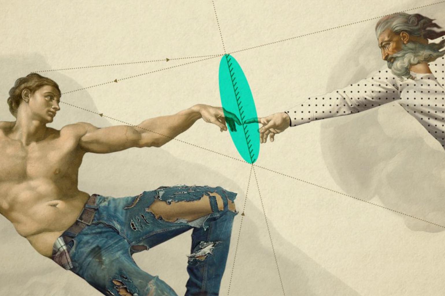
Several themes explore the same emotional or ideological spaces as the distressed surface. Grunge fashion is one, and grunge typography too. The mega phenomenon of denim is another which is a century old. The tradition of lovingly faded, worn jeans one wore as a teenager has been recast in industrial form, precisely damaged and built to last. Gritty industrial interiors are yet another.

Underlying these visual trends is the idea-canvas on which they appear. They are global moods or themes that are an amalgam of political and economic shifts, with their attendant social and cultural anxieties. They provoke and support the visible movements.
Distressing is supported by the idea of underplaying one’s wealth, underlining a lower social status, or stating one’s protest against the economic order. It can be an act of ironic identification. It can be read as an attack on cool, studied rationality. It’s also a cry, a shout of emotional insistence with a suggestion of pain: notice me, and feel what I feel. It’s a neurotic gesture that’s positioned as a survival mechanism.
The gestures of an underclass are often tamed and co-opted by an overclass. Inside a tony restaurant, we can sit aside a chic distressed wall with plaster scraped off the brickwork, and signal not an identification with poverty but its opposite. Rebels and rulers are both welcome.

Alongside the co-opting of underclass gestures by the rich sits guilt, best characterised by growth of anti-corporate sentiment around the world. Guilt can be worn to signal virtue, creating a sort of market for ethical positions. When a flagrantly rich white woman wears a badge that reads “White privilege is real” you know that society’s genius and madness have collided and merged.
Ironically, the western tradition of the distressed surface has its roots in England’s stately homes of the 9th century, in ‘antiquing’, a treatment of furniture to create an artificial image of age. Once considered cosy, elegant and feminine, It has jumped out of its container and cloned itself multiply: gone viral in the truest sense. Given the social and upheavals that are in play around the world, distressed surfaces and their ilke seem set for a very long stay.
Itu Chaudhuri am a principal at ICD. He writes broadly on design, taking in connected subjects.
This piece was first published in a slightly modified form ‘Distress Signals’ in Business Standard, 14 September in Deep Design, a fortnightly column by Chaudhuri. It can also be found on their website.

