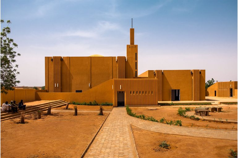
For the 8th episode of the Those Who Design series, I had the pleasure of hosting Yasaman Esmaili, an Iranian-American architect with a growing body of work in several interesting countries including Afghanistan, Niger and Iran. Yasaman’s practice, Studio Chahar is based in Boston. Today, we will be discussing one of her celebrated projects — the Hikma Religious and Secular complex in Niger. I am not only curious but fascinated with the brief, how the project came about and what transpired to result in the delivered building. An architect working in a foreign land on a sensitive brief to produce an architecture that brings a community together by potentially altering the use of a religious building is a promising start to say the least!
Edited excerpts from a long and rich conversation between Yasaman Esmaili and Anubhav Gupta
The origin story
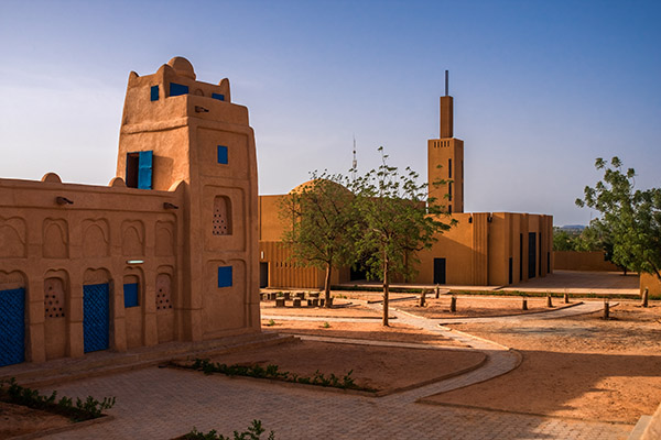
While part of the story on the foreign architect remains true of Yasaman, she shares that her design partner on the project, Mariam Kamara comes from Niger. A mosque in Niger, designed and built by a now deceased master builder and Aga Khan award winner, had become inadequate in size for the growing community of the area. The community’s initial intention was to tear down the old building to make way for a new, larger mosque. Yasaman and Mariam had conversations with the community to save the old building, and make way for the new. The dilemma of the change of use for the erstwhile mosque (something that was holy ground) was best left to the community by the two architects. The community came up with the idea of turning the existing building into a library for religious books owing to its proximity to the new mosque as well as the community school nearby which serves a few neighbouring villages. Yasaman shares that members of the community had come together as donors to fund this project.
Big Moves and the first sketches
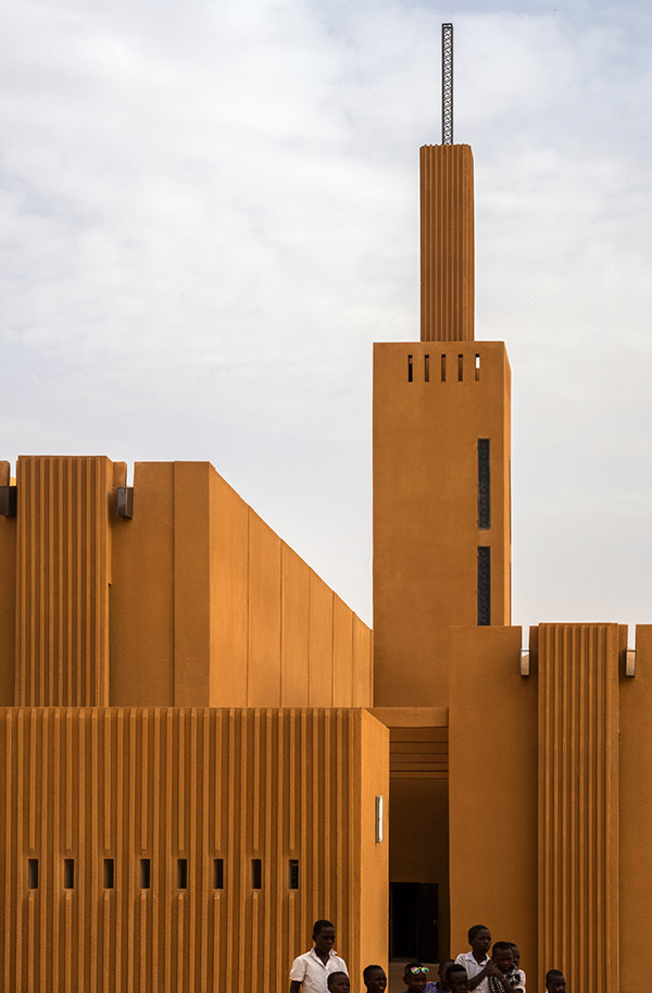
When I asked Yasaman about the big design moves and to verbalise the first sketch, she returned to the community’s aspirations of building a striking, grand new mosque with an imposing scale of a tall minaret, the first of its of kind in the region. One of the big moves, she shares is that they decided to place the new building away from the old and adjoining the public front edge of the site, thereby creating an interstitial space for the community to interact. Returning to the idea of scale for the new building, Yasaman describes their proportion studies to get the heights right to balance the client’s aspiration to stand out and the architect’s humility to blend in.
Going back to the first moves, moving the two buildings apart with an interstitial space in between formed the backbone of my enquiry. For me the landscape design seemed a bit alien to the site and its prevailing architectural forms. The intent did not seem clear to make the buildings talk to each other or for that matter to completely dissociate themselves as such… To me having created this potentially interactive space between the old and the new, it was a lost opportunity to leave it half-baked or merely as a park in her words.
Materiality, aesthetics and working with a community as an outsider
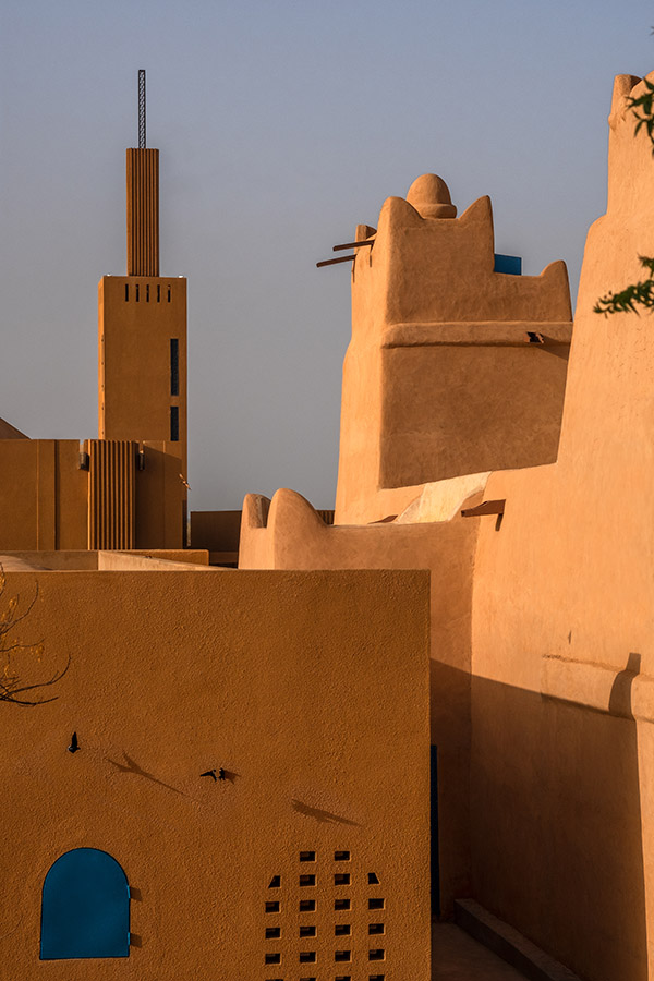
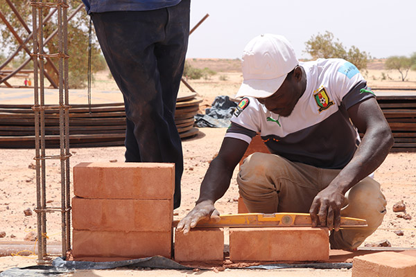
Given the existing context, prevalent building technology, materials and vernacular aesthetic manifestation, I was keen to find out the inspiration behind the striking yet balanced new build. Yasaman explained that the taller, grander building automatically meant an adoption of a new system of building and a different building materials. Learning from their two previous housing projects in the region, they quickly zeroed in on Compressed Earth Blocks (CEBs) as the primary material for this project not only because it was made from the soil in the region but also for better resistance and strength (as compared to traditional adobe blocks) in meeting the taller aspirations of the new building. She concedes that they also used concrete (which we did not get to talk about) and metal inspired from its use in the local building typically used decoratively for doors and windows.
Yasaman is humble to admit that many things could be improved on the project. Of these, her wish list includes a more detailed understanding in the use of CEBs without using much concrete and for better lighting solutions all in the direction of sustainability.
My question on aesthetics was rooted in the balance between the old building and the new, and to some extent my own associations that took me back to an almost minimalist art deco roots. Yasaman found my observation interesting but noted that the aesthetics may not have been a conscious choice ascribing it to the ‘art in architecture’. She reveals that she studied several local buildings and old vernacular plans for their proportions to set up the form and let function dictate further on the aesthetics. She uses the example of punctuating the building to bring in light as functional solutions leading to the aesthetic rather than using a divisional system on the façade to manifest the form.
During our chat, I remained fascinated by the fact that Yasaman was still an outsider to the community and if that or her gender had any role to play in the challenges faced during the project. Communication, Yasaman shared was easily set up as her design partner was from the very village they were working. Looking at the flip side, she articulates that sometimes outsiders may even be more trusted as they come with an unbiased view sans any baggage which to her mind prompts the need to strike a balance between the two for the best interests of the project. On my gender related question, Yasaman maintained that once strong local connections were made, being a woman may have actually enabled her to talk to groups that one would ordinarily not be able to.
Moving my enquiry from what was not to what clearly was, I was also intrigued by the awkward site line interruption of the ablution space between the two buildings.
The enquiry
Going back to the first moves — moving the two buildings apart with an interstitial space in between formed the backbone of my enquiry. For me the landscape design seemed a bit alien to the site and its prevailing architectural forms. The intent did not seem clear to make the buildings talk to each other or for that matter to completely dissociate themselves as such. Yasaman explained that they were trying to do as little as possible keeping the landscape design intervention minimal. To me having created this potentially interactive space between the old and the new, it was a lost opportunity to leave it half-baked or merely as a park in her words. Agreeing with me in principle, she articulated the adjacent uses of open spaces around both buildings but I was left wanting to see that intent translated in the physical design of the unbuilt space.
From an urban design standpoint, I was curious about the dialogue between the two buildings for axes, alignment, termini and the open space negotiating for view corridors/experiences as it did not seem clear either from the plan nor from the built form. Yasaman admitted that this was not a consideration between the two buildings necessarily but perhaps a more functional/movement representation for each building in itself. For me again, the project has all the ingredients for interesting relationships and dialogues between form, function and space which may have been further explored. Moving my enquiry from what was not to what clearly was, I was also intrigued by the awkward site line interruption of the ablution space between the two buildings. Agreeing with my observation in general, Yasaman explained the ambiguity in trying to loosely create a separation between the two buildings but not quite since eventually it was used by both genders.
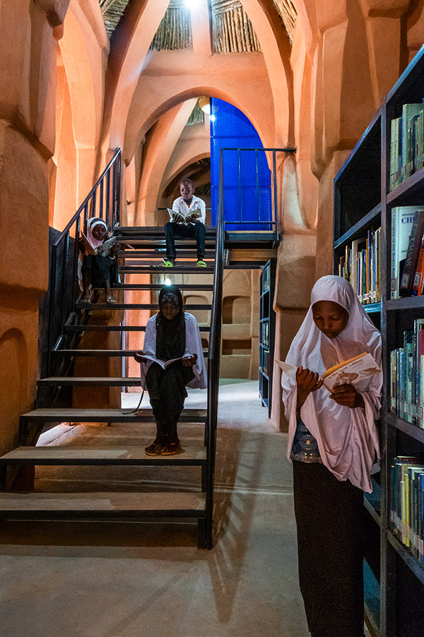
On proportion, I was being more critical about the imposing scale of the new building in reference to the old, which Yasaman unapologetically remarked as intentional and the best balance for the client’s aspirations and the architect’s restraint. She was accepting of the fact that it is ok for a mosque to be grand, which the clients were definitely happy with. She explained that from a scale standpoint the building’s use by other villages for congregation has further post-rationalised the grandness of the form. On my final query on taking inspiration from the old for the new and the use of the striking blue doors/windows in the old building, Yasaman confidently stated that the blue was added as a playful element in the old building owing to children using it and a neutral palette was maintained for the new building owing to its different use.
Looking back one can always find ways and means of what could have been better, but I particularly enjoyed the translation of this adaptive reuse project providing not only the possibility but the reality of adaptive reuse above and beyond what was intended through blocks and mortar.
The critic’s chair
When put in the critic’s chair to reflect on learnings, Yasaman shares how architecture can create an opportunity for potential and possibility. Originally intended as a space for men only, they found that their designs enabled the women of the community to claim one of the buildings and make it their own. Yasaman is humble to admit that many things could be improved on the project. Of these, her wish list includes a more detailed understanding in the use of CEBs without using much concrete and for better lighting solutions all in the direction of sustainability.
All in all through my chat, I found Yasaman to be an honest architect who is earnestly committed to creating an architecture of potential and possibilities – an idea that has power go beyond form and function and transform communities. I found this project not only inspiring but also a testament to what she intended and the result it finally provided. Looking back one can always find ways and means of what could have been better, but I particularly enjoyed the translation of this adaptive reuse project providing not only the possibility but the reality of adaptive reuse above and beyond what was intended through blocks and mortar.
***
