
If there is another pandemic this year has seen, it is the new brand identities and rebranding exercises by some of the biggest brands in the world. This time it is the tech giant, Google, and the rebranding is a response to the new working conditions imposed by the covid-19 pandemic.
Google has rebranded G Suite as Google Workspace, which is essentially a consolidation of the Google productivity apps — Gmail, Calendar, Drive, Docs, Sheets, Slides, Meet, and other features that support remote working. Google Workspace will also have new features like allowing users to tag others in docs and sheets, creating and collaborating on a document with guests in a Chat room, and easily sharing the documents.
Javier Soltero, VP and GM, Google Workspace, announced the launch of Google Workspace through a blogpost a few days ago.” A new brand identity that reflects our ambitious product vision and the way our products work together” is one of the three major developments.
The New Brand Identities
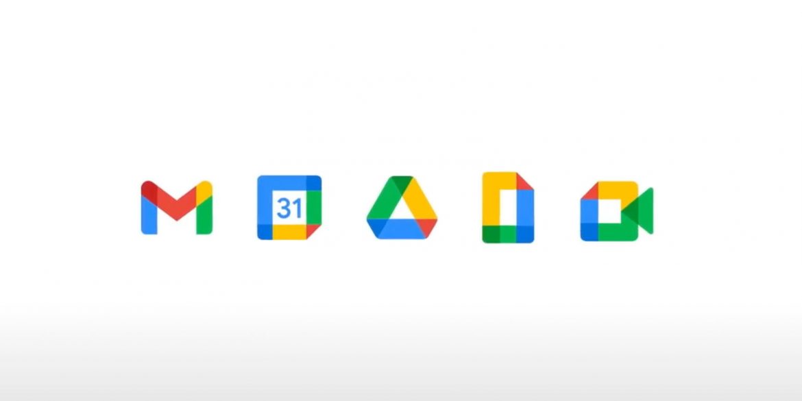
“Our new Google Workspace brand reflects this more connected, helpful, and flexible experience, and our icons will reflect the same. In the coming weeks, you will see new four-color icons for Gmail, Drive, Calendar, Meet, and our collaborative content creation tools like Docs, Sheets, Slides that are part of the same family. They represent our commitment to building integrated communication and collaboration experiences for everyone, all with helpfulness from Google,” Soltero stated in the blog.
While the rebranding exercise is part of the tech giant’s attempt to create a consolidated brand (something that Google has always aspires to), many people are skeptical about the changed brand-marks in the Google colours. “This is a nightmare for end users. You had recognisable branding for gmail, docs, calendar and meet based purely on the single colour and shape… why destroy that by making messy, easily confusable icons that confuse the branding and recognisability of each service?” Stewart Falconer commented on the new identity. Many others had similar feedback. “I’m sorry, Google, but changing all of your app’s icons to use all of the same colors makes it harder to quickly identify them on my home screen. It’s easier to find colours quickly than it is to find shapes,” a YouTube user named John Abraham commented. Has Google gone overzealous in integrating its apps that end up looking very similar to each other
***