
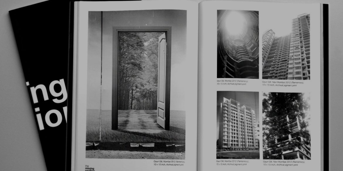
India’s continued absence at the Venice Biennale since 1947, except for sporadic appearances, has been a source of major concern and disillusionment in the Indian art world. The Missing Pavilion, an exhibition sponsored by the Shivadasani Inlaks Foundation and curated by students of the Visual Arts JNU, Delhi generated a dialogue on the presence of absence.
Lopez Design was commissioned to design the identity, posters, brochures and invites for the exhibition on the campus. Anthony Lopez, Principal of Lopez Design and Deekshit Sebastian, Senior Designer at Lopez Design recall their journey to capture an elusive idea through design, geared to make a substantial statement contributing to the ongoing socio-political commentary on India’s standing in the art world.
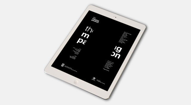
Anthony: When something is missing, how do we show it visually? It was a once in a lifetime opportunity – to show nothing and show everything! It was not only a challenge in terms of the subject matter, but also to materialize as graphic design: to put up something that says there is nothing. We were completely consumed with the process.
Deekshit: When I look back, it was a very quick trip. It happened very fast. The content was directed towards the missing element. Initially we were trying to identify ‘i’ with India and make India disappear from the pavilion visually. Then, we looked at the visual approach of how to camouflage and there was always this contradiction – how to put something there and make it go away. We started to find out how often India was missing from the Biennale. In fact, India was present at the Venice Biennale just four times. Finally, when we created a poster with text and removed a whole chunk from the centre, the clients just loved it. The path became to amplify absence by the elements around it.
Anthony: The dilemmas continued – can we actually communicate something without showing it out there? Most importantly, this was a project that was highly contextual in nature. It was meant for a specific audience in the art world, special invitees, and it was about creating awareness at this level. The clue to provide this “missing picture” needed to be obvious; it had to draw on something familiar within the spatial content. To make the unknown known, you need the known in place. If the final content was meant to have text, we had to somehow obliterate that text, not have it there. A diabolical struggle!
Deekshit: One thing I liked very much about the final solution is that people read “Missing Pavilion” in the identity. They did not realize anything was missing. It was something hidden and not obvious. It was very much about the presence of absence just as at the Biennale, where people did not realize that India was not there until someone pointed it out. The logotype of the final identity expresses that as well. It was a nice play of ideas that really got to the crux of the matter.
Anthony: Deekshit came up with the idea and stuck with it till the end. It is not obvious, as he said, and it is extremely apt. India as a country also seems to believe it is not missing out on anything by absenting itself from the Biennale. The message had to communicate that it is important to be there. The ‘I’ of the India is missing suggesting the lack of importance we give to art. We do not think art is important, or perhaps, our priorities are elsewhere. Maybe we think we should become rich first and art comes after that. But art is an important part of our fabric and needs to grow together with everything else.
Deekshit: We had three concepts and one actually showed India missing on the world map. We wanted to create a shock – how could this happen? The same level of shock is not there when we are missing at the pavilion and we wanted to draw a comparative. But the artistic license ends here as the solution would have been politically problematic. Another concept showed Missing Pavilion in a fuzzy manner, which blurs your vision about India. There are artists who want to be understood; for the art world however, India is a blur. Then we had a concept with a lion, playing on the pavi- ‘lion’ but again we felt it would be misunderstood and confused with the Make in India campaign. In all of our concepts, in everything we did, our main concern was to make people question.
Anthony: As communication designers we come up with visual metaphors quite naturally. It depends on what we are trying to communicate. Within the terms of our artistic license, we are constantly trying to explore and exploit. Yes, we enjoy and indulge in this kind of work but the end benefit is for the consumer. Most projects are serious in nature and the lines are clearly drawn. It is also about where the fulcrum lies. In this case, it was on the other end. Yes, we had little time but the new school says “Do it now!” different than the old school which would say “Take all the time you need.” We are now churning out solutions as quickly as we think.
Deekshit: In this project especially, we went by instinct. There was no time to test, in any case.
Anthony: It is an interesting time for us as human beings. You know, earlier when we were unwell and we went to a doctor, he would check your pulse and your temperature. Then after diagnosing your symptoms, he would prescribe medicine. Today, we have to undergo a battery of tests. The earlier expectation was about taking a call. Now, it is about testing. In design, contrarily, we have to make very quick decisions. It is still very critical to test and check. The most interesting questions that arose for me from this exercise was – how do we experiment with daring and not be afraid to fail?